Project Description
Customer
Espresso Botero
Brief
Do something different! Stylish yet minimal. Show me what you can do.! It’s for Maro, Marco Vianei and it’s the best coffee blend you’ll ever have!
Project Status
Testimonial
Description
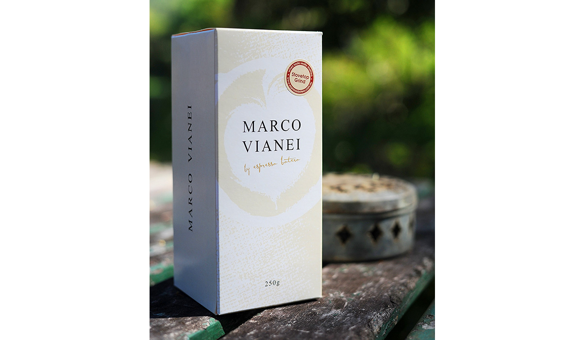
Danny Young from Espresso Botero, a truly amazing and progressive micro roasting coffee company based in Maclean, NSW, asked me to create a brand for their premium blend; Marco Vianei Espresso. Clearly, the name had very strong Italian semantic, and Danny had stipulated his enjoyment of the mystery around the name, so I set about identifying a “feel” that would encapsulate this.
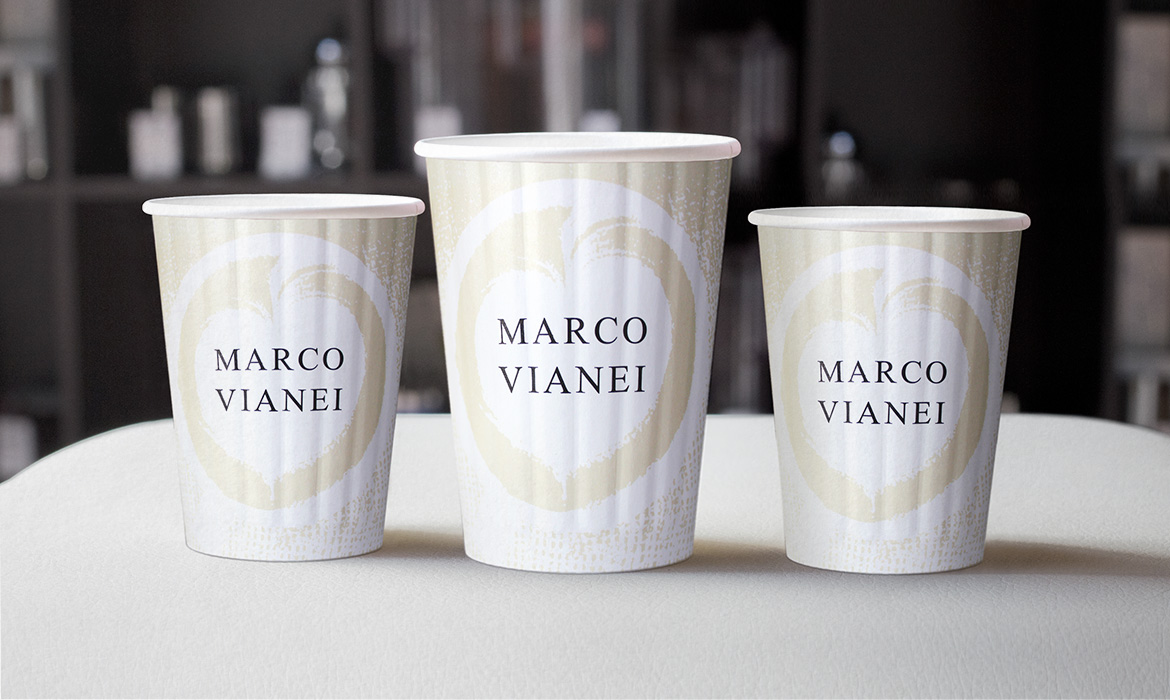
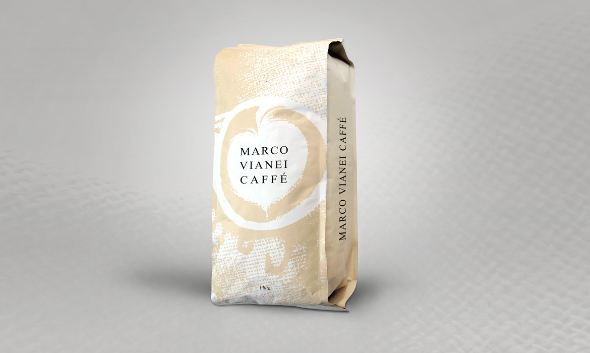
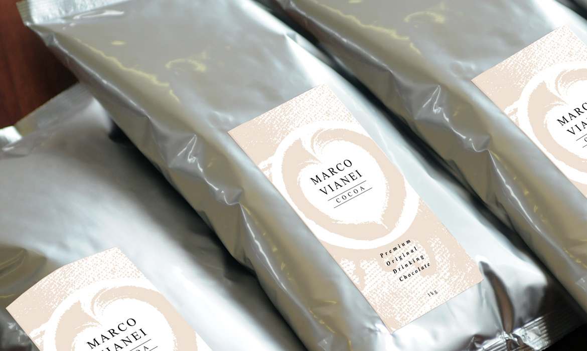
After much creative suffering over many visual cliches, I noticed a coffee ring mark on a A4 sheet I’d rested my cup on next to my computer. It occurred to me that most coffee related vision had already been done, including the coffee stain, so I anchored the design instead using the strength of the words themselves and the simplicity of Times New Roman in caps. I recalled that Danny had mentioned he liked the rawness of hessian textures, but I couldn’t see them fitting into what was essentially developing into a very minimal design.
At that point I swapped my coffee for red wine (as it was getting late) and photographed my coffee stain anyway. I then just played with the coffee stain marks in Photoshop, combining them with hessian textures and the type I’d chosen and eventually discarding them completely in favour of coffee art presented as a subtle background pattern in combination with a carefully scaled monochrome hessian texture.
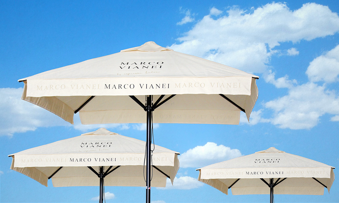
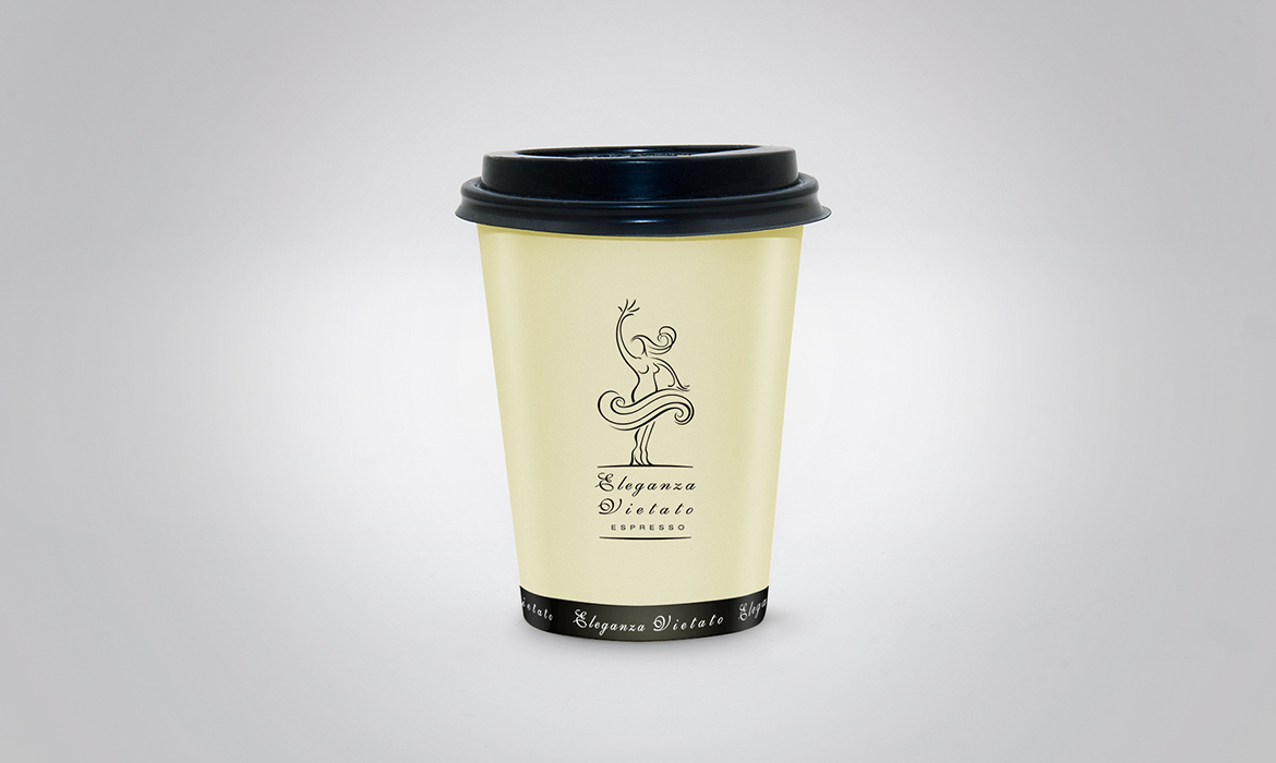
The three take away cups you see above was how I presented the design the next morning and since then, it has been applied to all of Espresso Botero’s Marco assets including:
- Ceramic Coffee Cups
- Take away cups
- Cafe Umbrella’s
- Sales Talkers and Price Lists
- Stationery
- Cafe Barriers