
Project Description
Customer
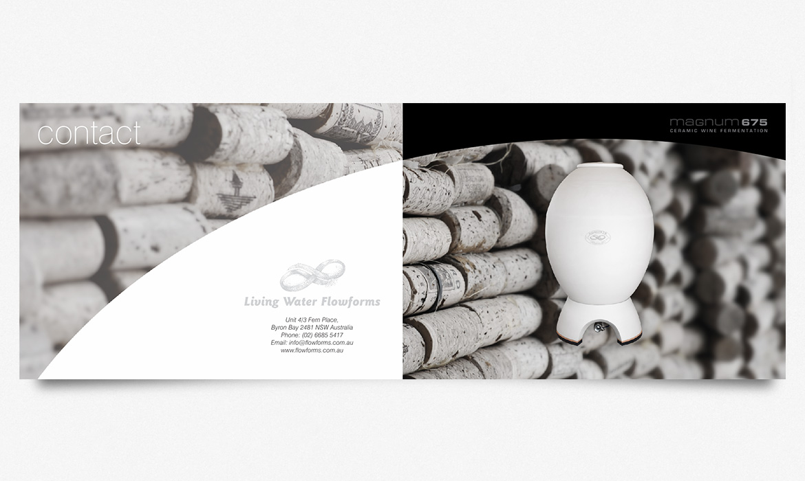
Living Water Flowforms
Brief
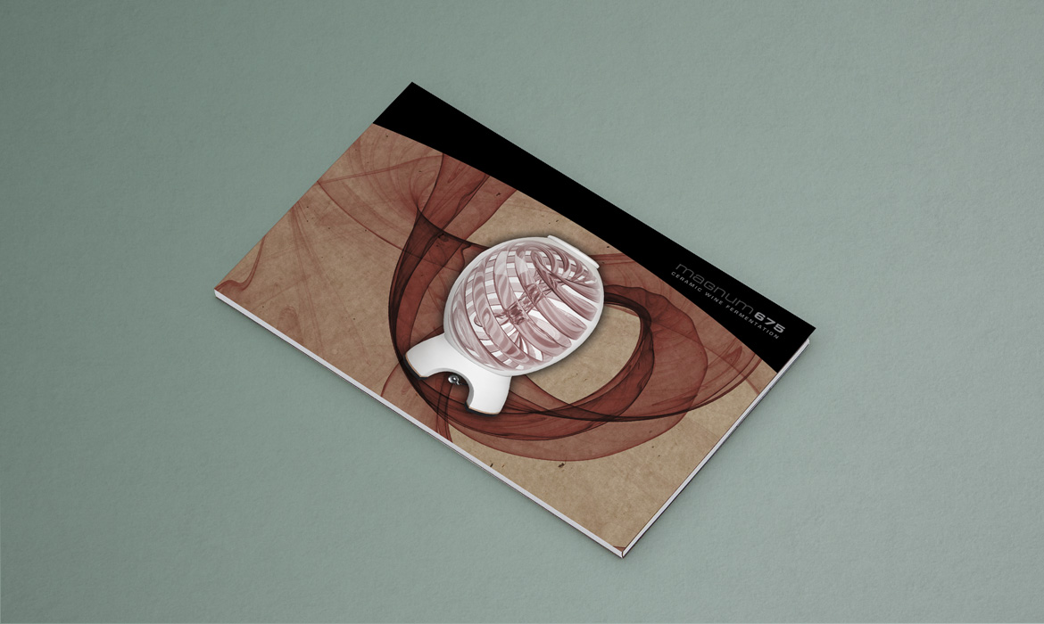
Open Brief: Create a strong identity for “Magnum” Ceramic Wine Fermentation innovation. Target wine makers internationally.
Project Status
Testimonial
“Carl showed his clear understanding of my objectives and characterized my product with precision and style. The booklet he produced has been indispensable as both a educational and promotional tool. Carl produced all of the graphics and copy which I then changed slightly and signed off on. He then supervised the print production leaving me free to focus on my core business. Outstanding work!”
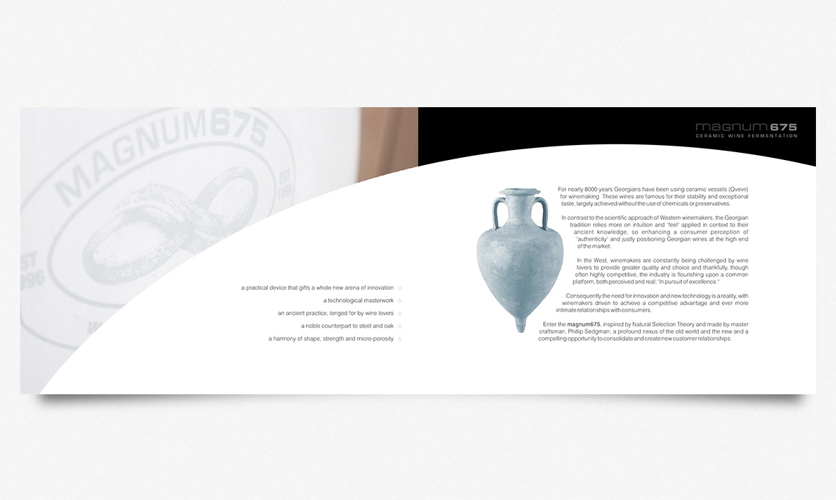
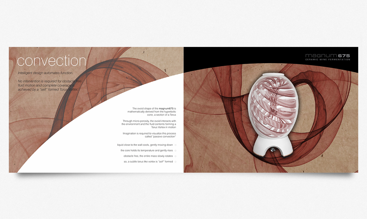
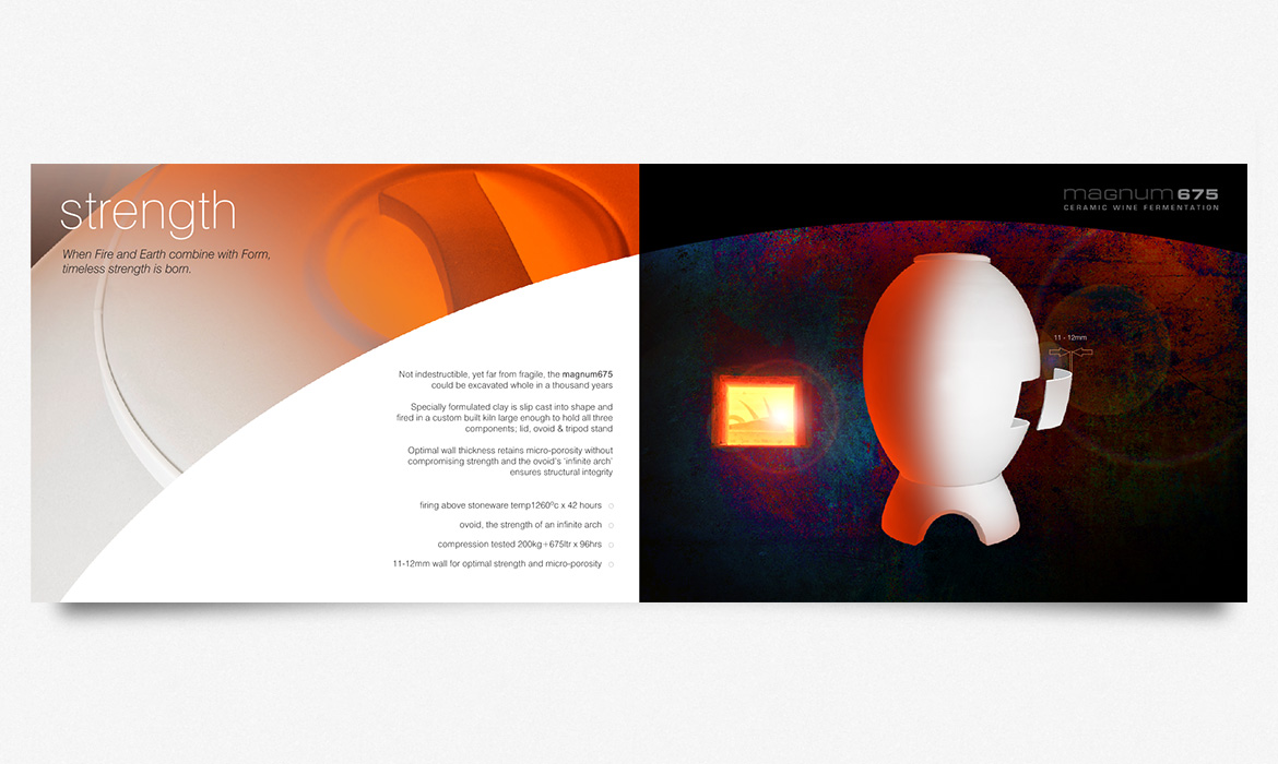
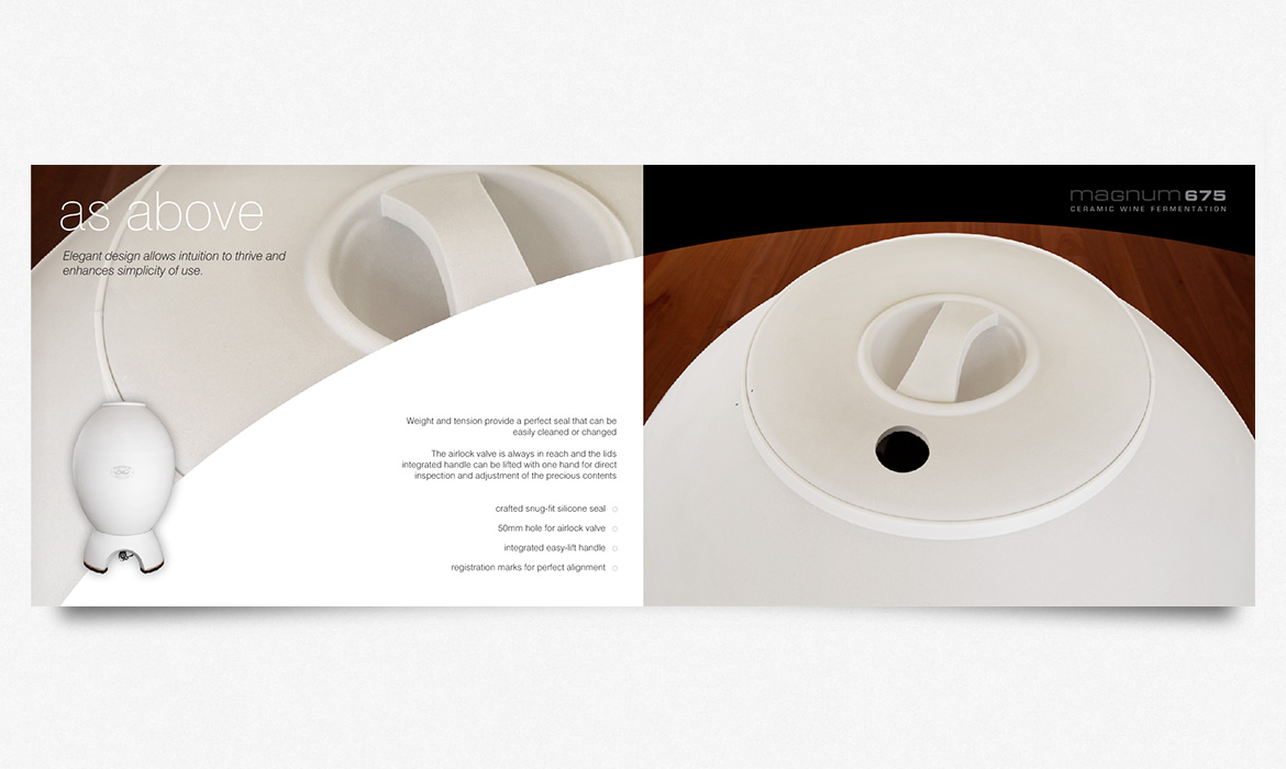
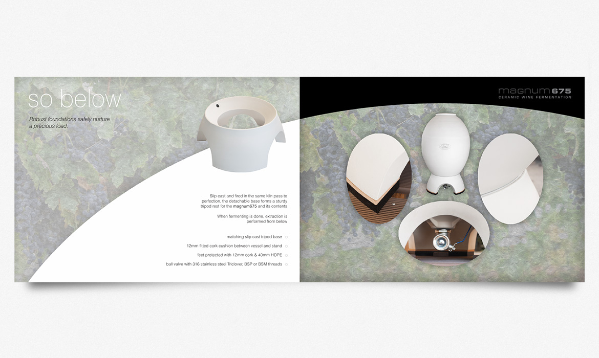
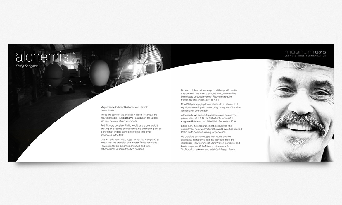
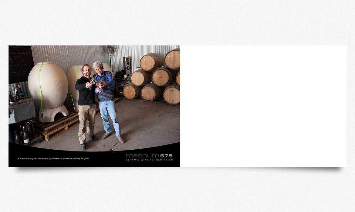
It was an honour to have been commissioned by Master Ceramicist, Phil Sedgman to create a brand and marketing stream for his new product, “The Magnum 675 Ceramic Wine Fermentation Vessel”, a truly innovative alternative to Barrel’s for wine fermentation and storage. This ground breaking innovation was made possible by a combination of Phil’s extreme skill as a ceramicist and the nexus of cutting edge kiln fired slip casting with old world earthen wine fermentation methods.
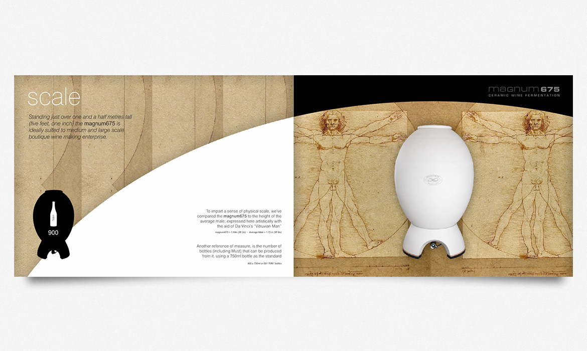
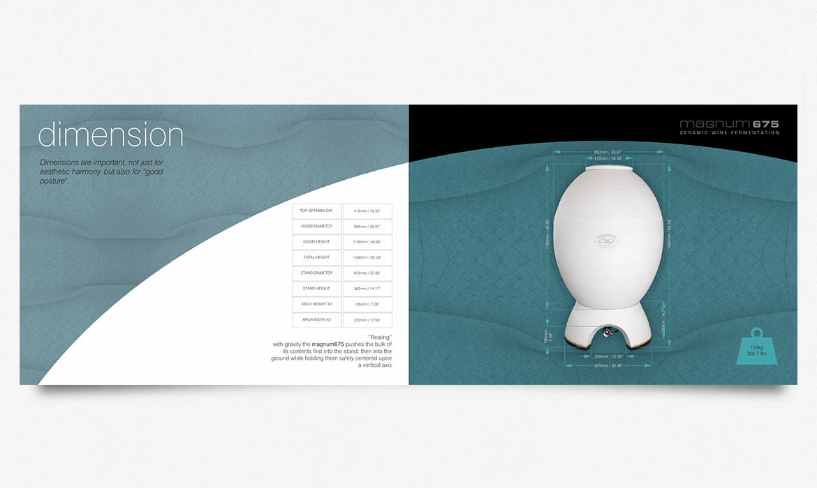
My task was to represent the product in a clear and positive way, while illustrating it’s features and benefits and context as a “revolution” in wine making technology.
I chose a landscape A5 finished size for the booklet and set about introducing the product with carefully written, direct yet slightly poetic copy. Each discreet unit of information delivered by the copy was visually demonstrated combining photography and digital manipulation.
If you open a A5 booklet it forms the “real estate” of an A4 sheet of paper which is a typical way of presenting information to say the least. By taking an A3 sheet of paper and splitting it down the middle long ways, and then folding it in half long ways, you arrive at an A5 booklet. Given appropriate graphics, when viewing a A5 booklet presented as spreads in this way, the effect is much the same as looking at a full A3 sheet; but at half the expense.
Adjusting the graphics to fully monopolize this effect meant capitalizing on cohesion between the various graphic elements which were necessarily clipped back to their bare minimum. The inspiration for the various elements came naturally from the “Eggs” themselves with their sensual curves and pale complexion.
Contrast was added between the left and right pages of each spread to create a sense of drama aimed at keeping the reader engaged and the copy for each spread intentionally complemented that contrast.
The initial run was short and somewhat disappointing because of the stock used by a remote printer was too thin, but this was soon addressed in following productions by using a thicker stock for each spread and printing the whole presentation onto gloss rather than satin stock.
